Enhancing access to health programs at home for users to improve conversion
Enhancing access to health programs at home for users to improve conversion
Enhancing access to health programs at home for users to improve conversion
Timeline
Timeline
1 month (2020)
1 month (2020)
Team
Team
4 UX/UI designers
4 UX/UI designers
My role
My role
UX/UI design, project management, stakeholder management
UX/UI design, project management, stakeholder management
Overview
Overview
For this project, my team worked with a fitness company, Grillz&Granola, in a 3-week design sprint and conducted user interviews and other research methods to create the solution we did.
For this project, my team worked with a fitness company, Grillz&Granola, in a 3-week design sprint and conducted user interviews and other research methods to create the solution we did.
At first, our goal was to reorganize their On-Demand class purchasing experience through their website. However, after resolving potential scope issues and completing our initial objective, we took an opportunity to pursue additional goals and highlight their flagship classes to increase conversion and user retention.
At first, our goal was to reorganize their On-Demand class purchasing experience through their website. However, after resolving potential scope issues and completing our initial objective, we took an opportunity to pursue additional goals and highlight their flagship classes to increase conversion and user retention.



The problem.
The problem.
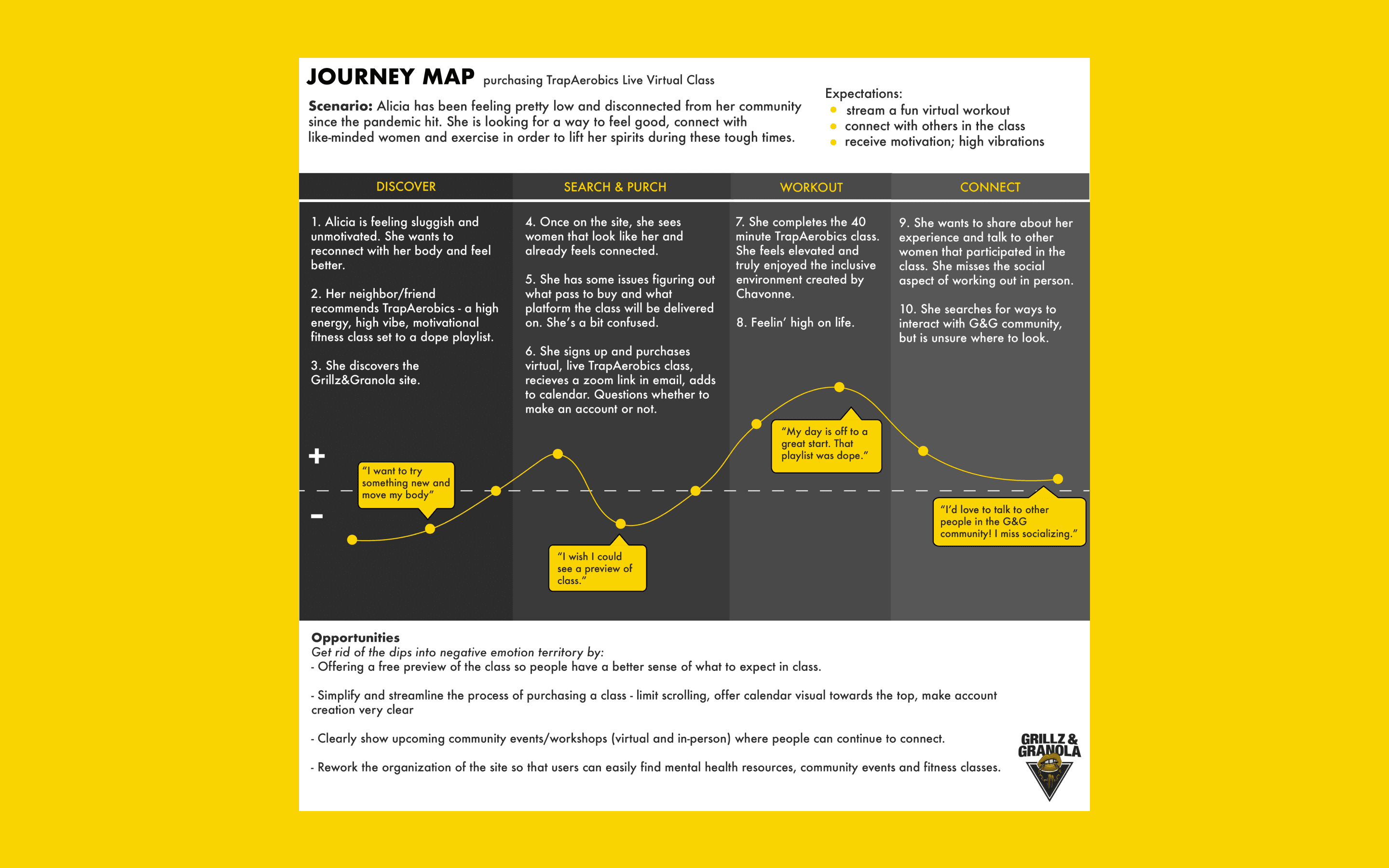
In 2020, many people looked for ways to access at-home exercise programs to maintain wellness due to city ordinances to stay indoors. With the sudden changes, our clients quickly built a site to continue their services. However, the users of our client's platform struggled with navigation and accessing the exercise programs with ease, impacting their user retention and conversion. For our client, they wanted to feel confident in transitioning their business model into a primarily online platform.
In 2020, many people looked for ways to access at-home exercise programs to maintain wellness due to city ordinances to stay indoors. With the sudden changes, our clients quickly built a site to continue their services. However, the users of our client's platform struggled with navigation and accessing the exercise programs with ease, impacting their user retention and conversion. For our client, they wanted to feel confident in transitioning their business model into a primarily online platform.
The process.
The process.
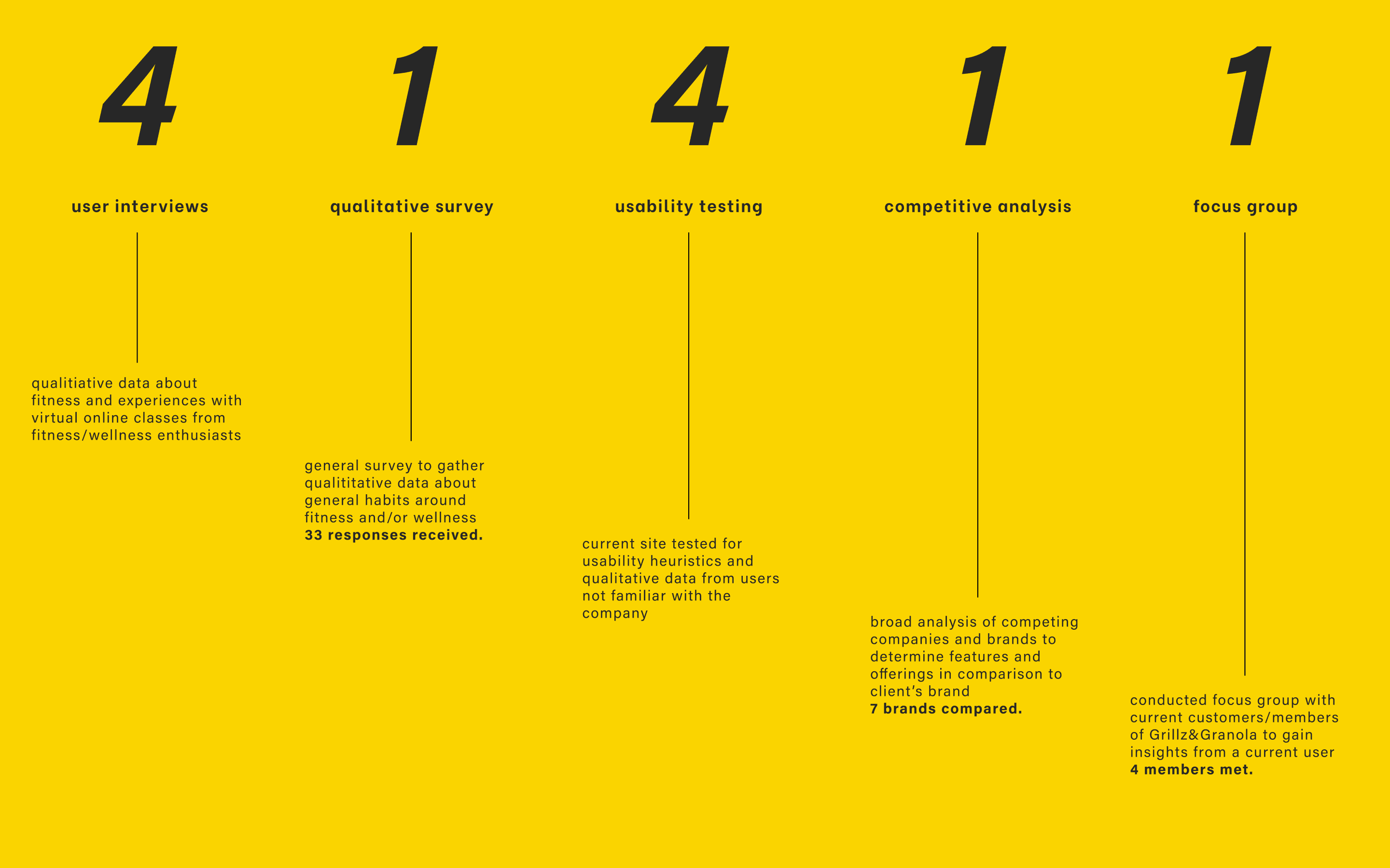
We initiated our process by aligning with our stakeholders about their goals, the issues that they were facing and their understanding of their users. They wanted to keep their current retention with their users and find ways to increase conversion. Afterwards, we followed up with further research to fill in our knowledge gaps and discovering areas of opportunity, using tools like surveys, focus group interviews and affinity maps.
We initiated our process by aligning with our stakeholders about their goals, the issues that they were facing and their understanding of their users. They wanted to keep their current retention with their users and find ways to increase conversion. Afterwards, we followed up with further research to fill in our knowledge gaps and discovering areas of opportunity, using tools like surveys, focus group interviews and affinity maps.
Once we identified the primary issues and iterated through several ideas, we arrived at a solution that increased speed of tasks, reduced number of clicks and reduced error rates when looking for classes to sign up for.
Once we identified the primary issues and iterated through several ideas, we arrived at a solution that increased speed of tasks, reduced number of clicks and reduced error rates when looking for classes to sign up for.




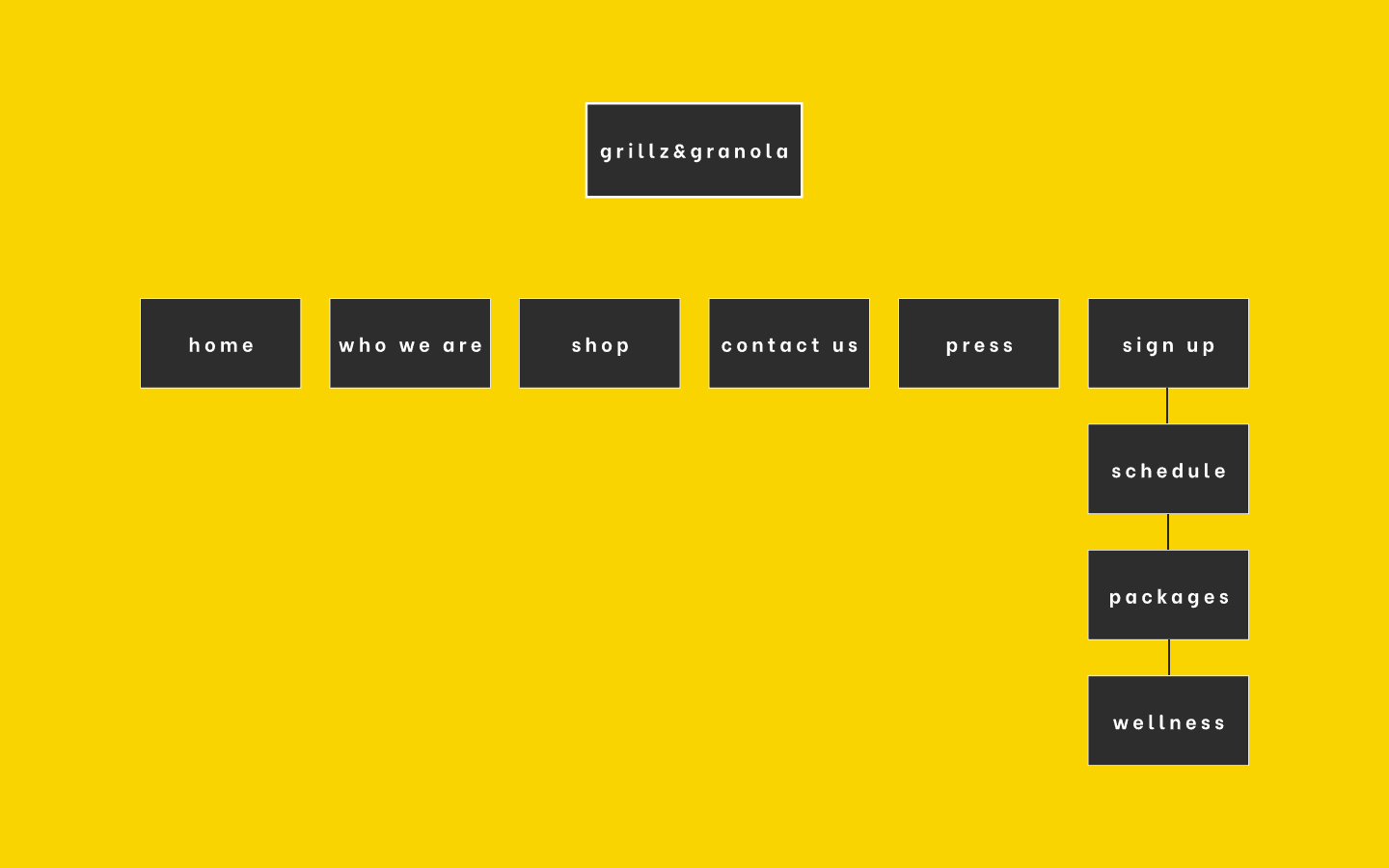
Existing Site Map

Existing Site Map

Existing Site Map

Existing Site Map
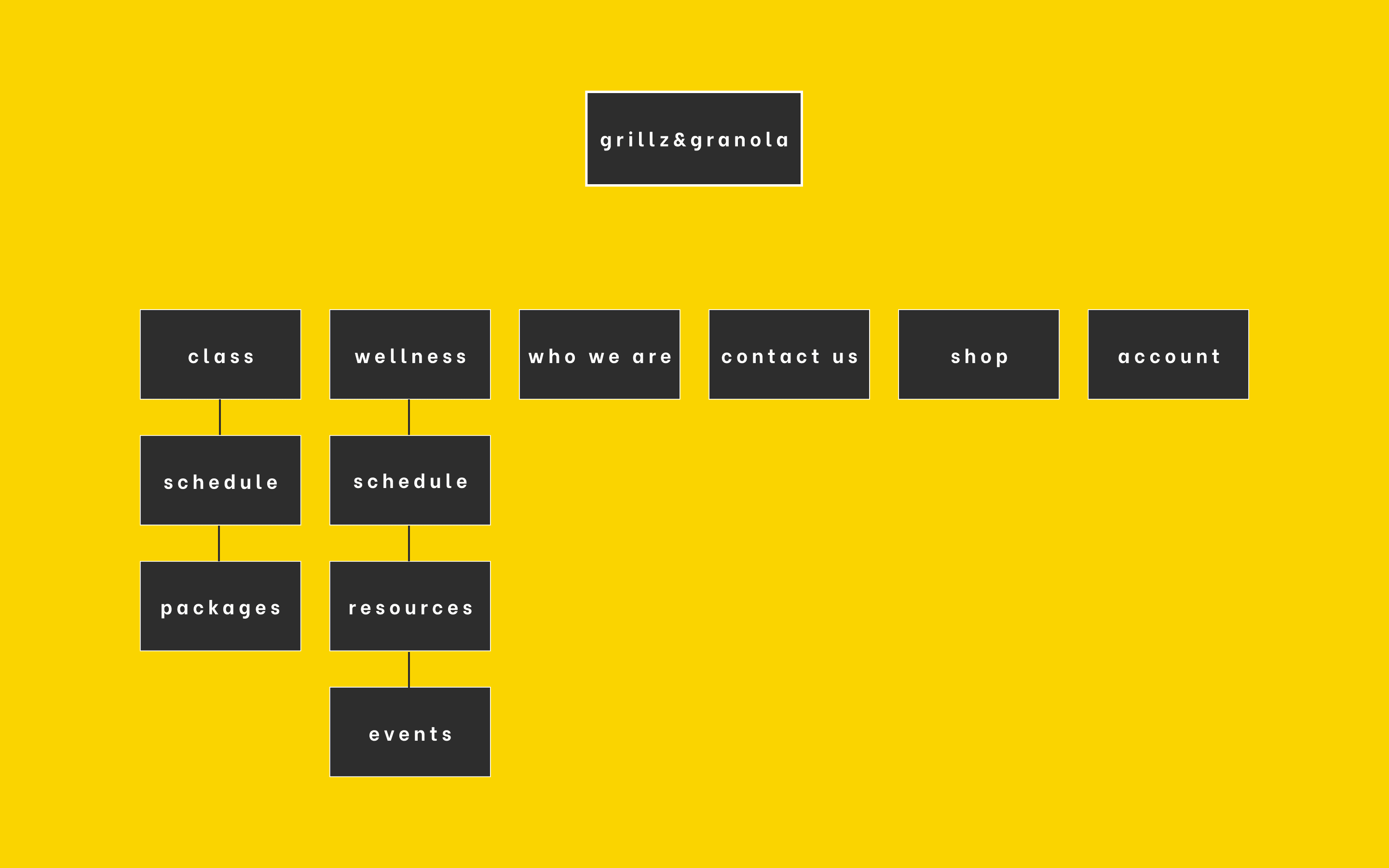
Proposed Site Map

Proposed Site Map

Proposed Site Map

Proposed Site Map
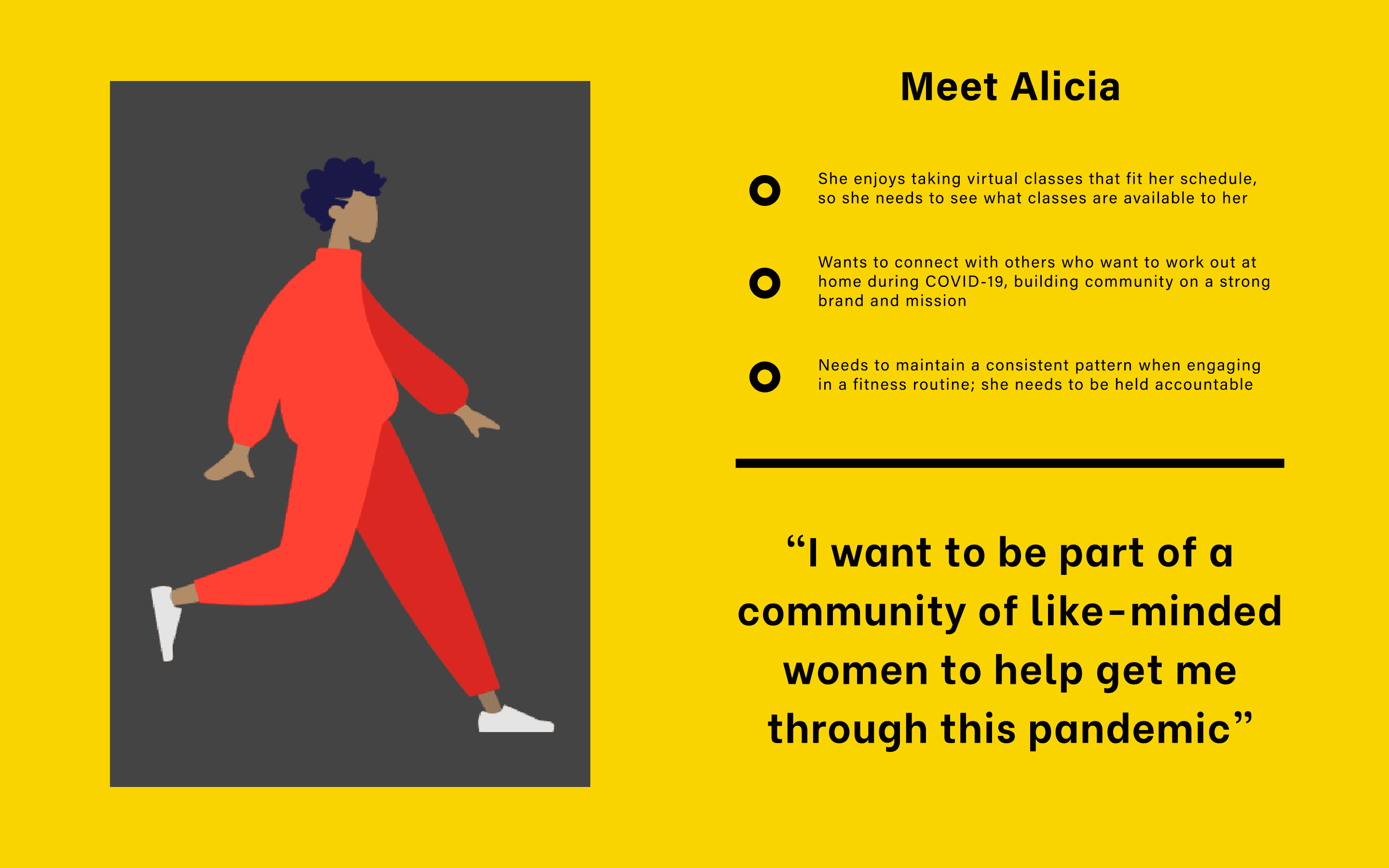
Understanding the persona.
Understanding the persona.


UI design phase.
UI design phase.
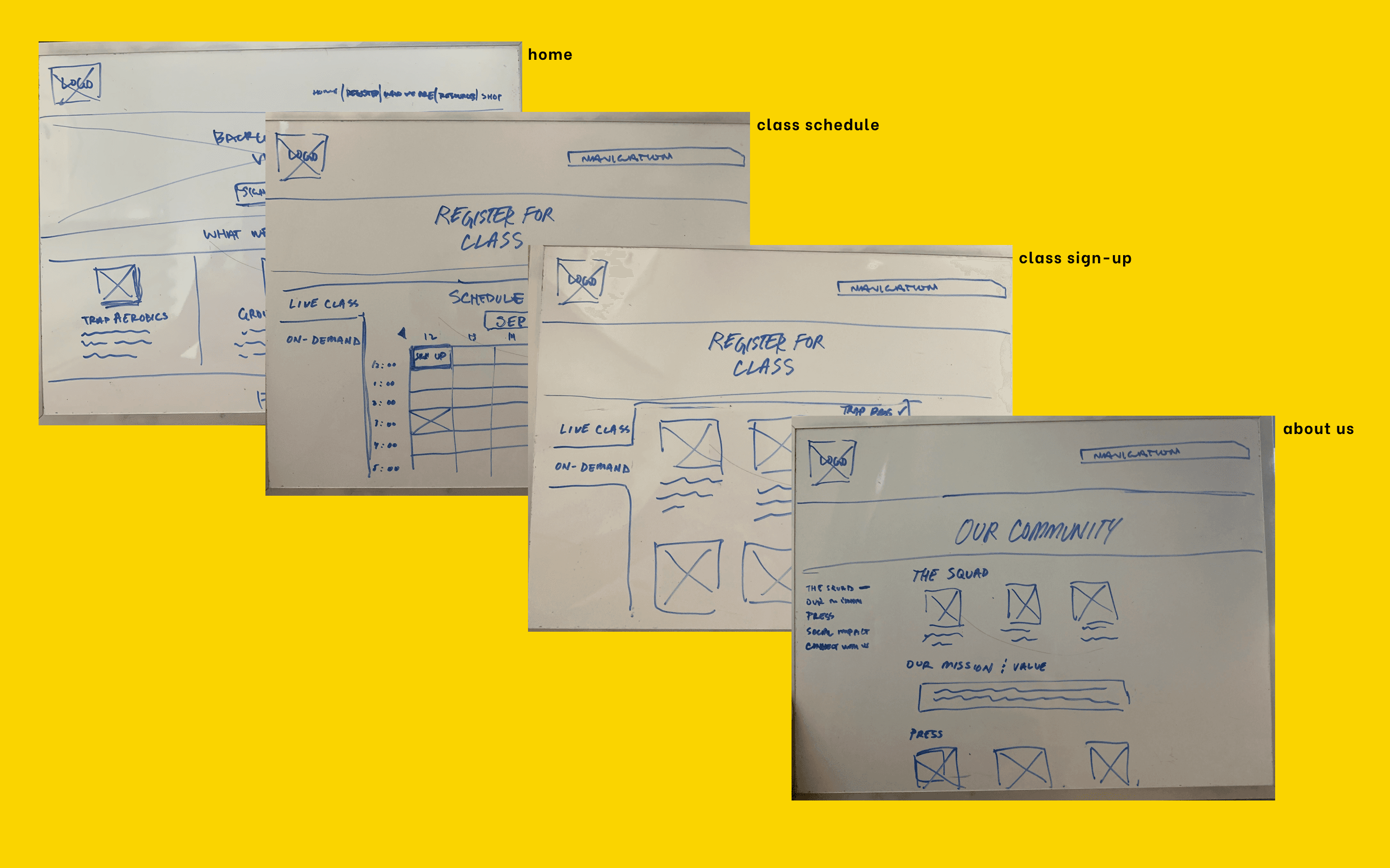
Before jumping into prototyping and creating wireframes, we ideated a lot. We started with a design studio to quickly come up with several ideas in a short amount of time.
Before jumping into prototyping and creating wireframes, we ideated a lot. We started with a design studio to quickly come up with several ideas in a short amount of time.
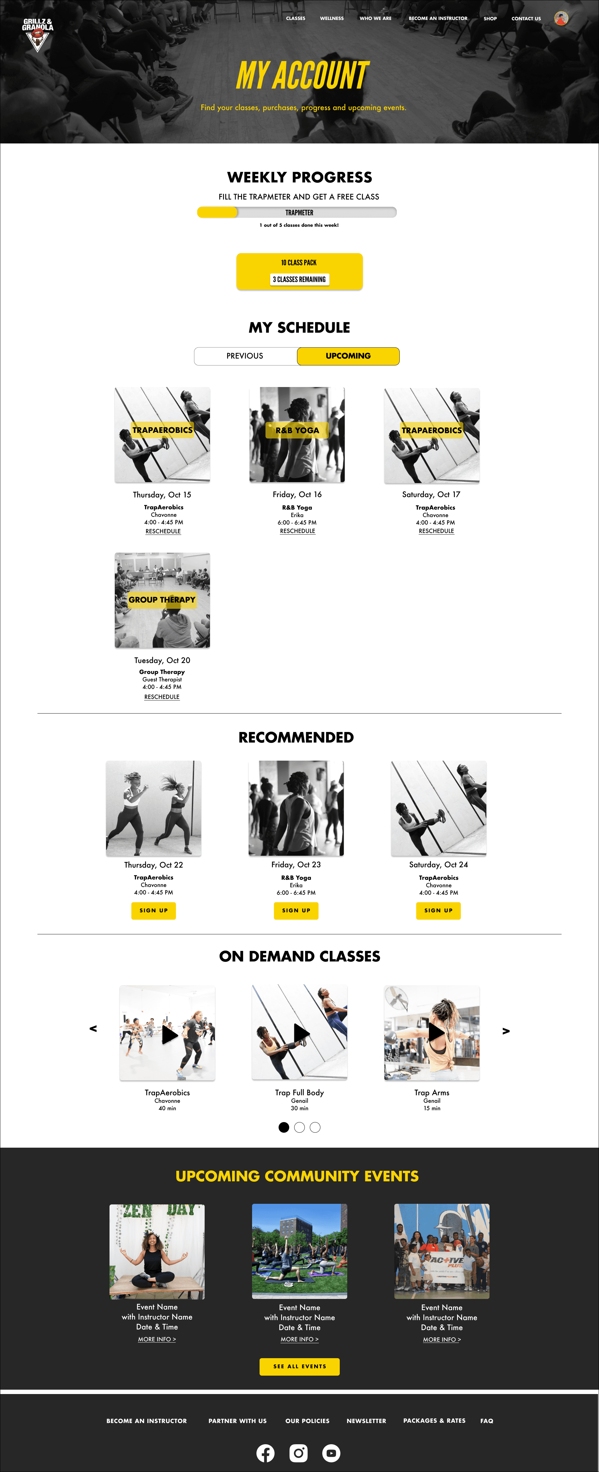
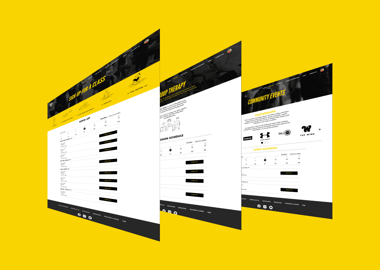
I knew that the layout had to be simpler and yet highlight mental health as an important aspect of the brand. I focused on specific screens that we felt were crucial in achieving that goal. I had the idea to put the key information in three columns for most of the pages. This would ensure familiarity and ease of scanning for users.
I knew that the layout had to be simpler and yet highlight mental health as an important aspect of the brand. I focused on specific screens that we felt were crucial in achieving that goal. I had the idea to put the key information in three columns for most of the pages. This would ensure familiarity and ease of scanning for users.


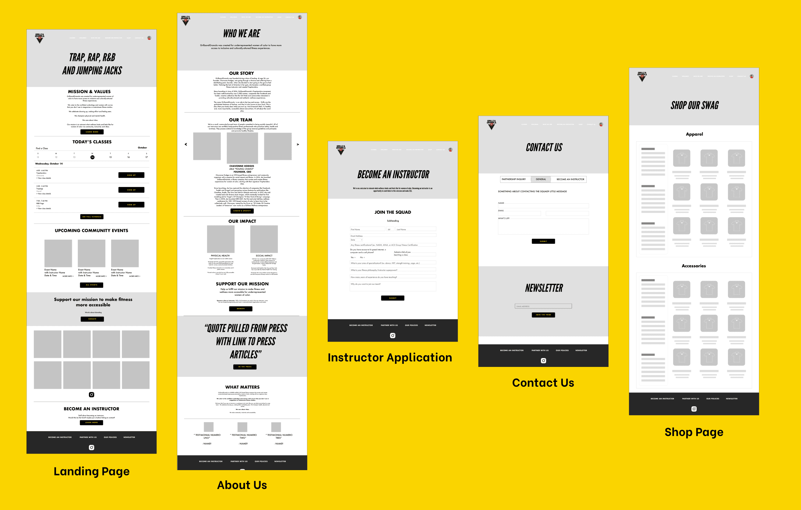


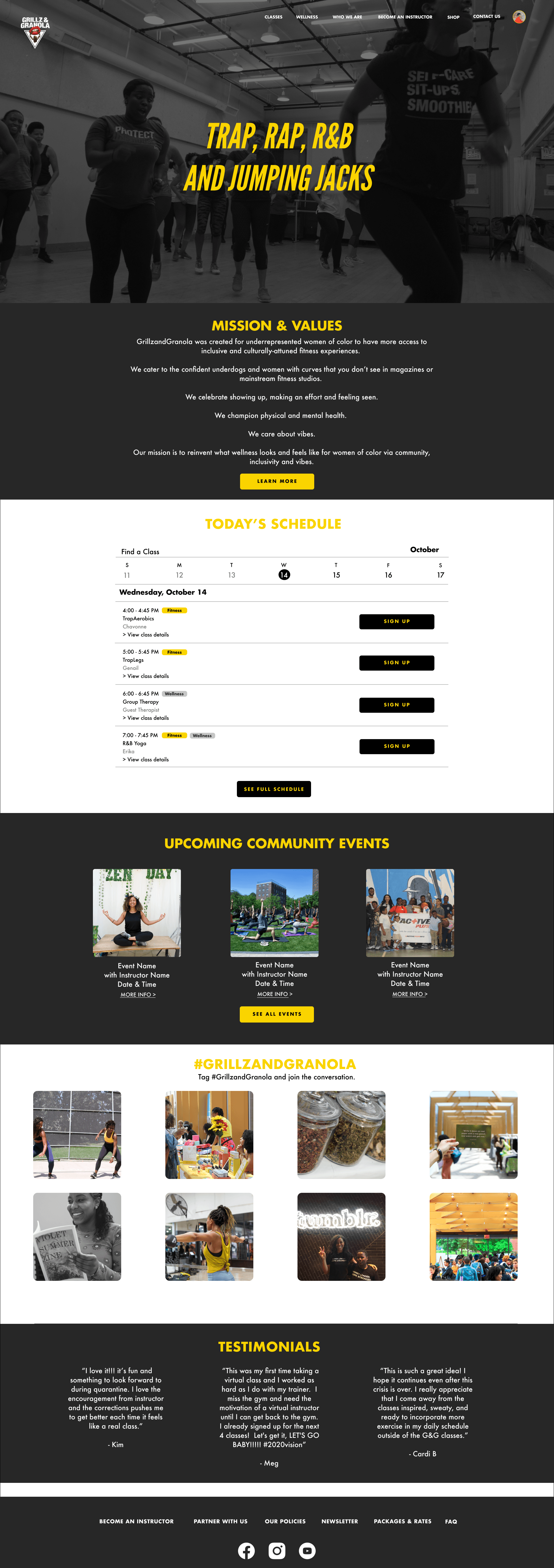
Final designs.
Final designs.
For the prototyping stages I took lead and organized the wireframes quickly for testing. With the help of a teammate, we established a basic layout for all of the frames and tested with a few classmates.
Takeaways from our user testing:
Users didn’t understand some of the copy used to label navigational elements so we rearranged them for following iterations
Our content was laid out inefficiently so we established stricter style guidelines for following iterations
We had to consider the constraints of Squarespace (the platform they were using at the time of this project) when formatting the screens
Our measurement
During user testing, we measured accuracy and speed of completion of tasks, such as finding certain classes or information, to determine if our solutions were moving in the right direction. This KPI also helped inform stakeholders and highlighted the value of our proposal.






"Your work has inspired and ignited us to keep going!"
"Your work has inspired and ignited us to keep going!"
"Your work has inspired and ignited us to keep going!"
Chavonne Hodges, founder of Grillz&Granola
Chavonne Hodges, founder of Grillz&Granola
Time for growth.
Time for growth.
This was a really great project to work on with a collaborative design-focused team. The client had expectations but we were able to exceed them and deliver something that they agreed would take their business even further.
This was a really great project to work on with a collaborative design-focused team. The client had expectations but we were able to exceed them and deliver something that they agreed would take their business even further.
Initially, we were thinking about how to rearrange content on the site while keeping the same theme and aesthetic, true to the brand. After researching and discovering what the people needed, we didn’t think our solution was going to work.
Initially, we were thinking about how to rearrange content on the site while keeping the same theme and aesthetic, true to the brand. After researching and discovering what the people needed, we didn’t think our solution was going to work.
The solution had to be more than just a few pixels being changed. We knew that the brand had to grow and their content was expanding. This gave us the room to reorganize their site in a way that showed their dedication to their customers and give them a place to feel ready to grow themselves.
The solution had to be more than just a few pixels being changed. We knew that the brand had to grow and their content was expanding. This gave us the room to reorganize their site in a way that showed their dedication to their customers and give them a place to feel ready to grow themselves.
Taking lead for the UI portion of the process, I learned a lot about how establishing structure and communication goes a very long way to delivering a great product. Without those things, our solution would have not been fit for an awesome company like Grillz&Granola.
Taking lead for the UI portion of the process, I learned a lot about how establishing structure and communication goes a very long way to delivering a great product. Without those things, our solution would have not been fit for an awesome company like Grillz&Granola.
